mono-color-skill
One-ink editorial print image skill — warm paper, halftone photography, active negative space, and restrained typography.
原始仓库简介 · 中文摘要待补充 · agent-skill / ai-agent / claude-skill / editorial-design / generative-art / halftone
README / 项目原文
中文 · English
Monocolor Editorial Print
A one-ink and controlled two-ink editorial image skill for posters, zines, portraits, packaging, and visual field notes.





Turn a theme, sentence, object, or supplied photograph into an original editorial image. The skill defaults to controlled two-ink with one dominant plate and one narrowly assigned accent plate. Explicit one-ink or monochrome requests remain pure one-ink. White, cool gray, or pale-beige substrates are selected from the image and palette; contemporary editorial is the default, while vintage treatment appears only when requested.
It preserves a visual system rather than copying a reference. Every composition is rebuilt around the subject, intent, words, and image role.
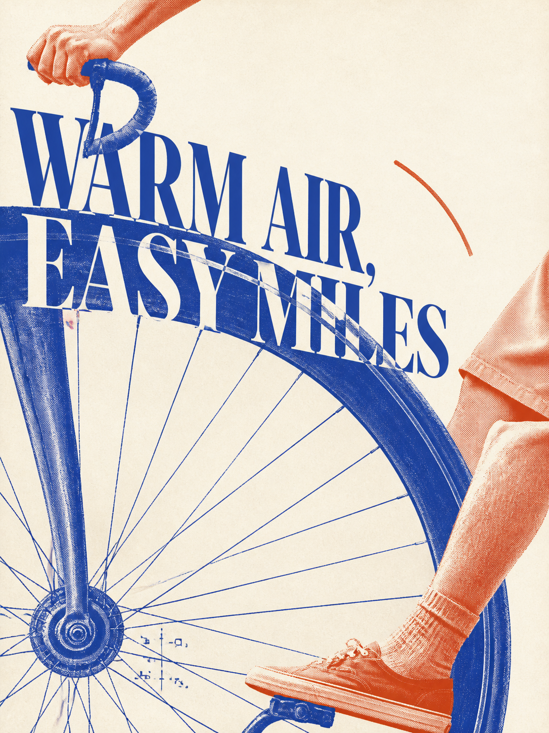
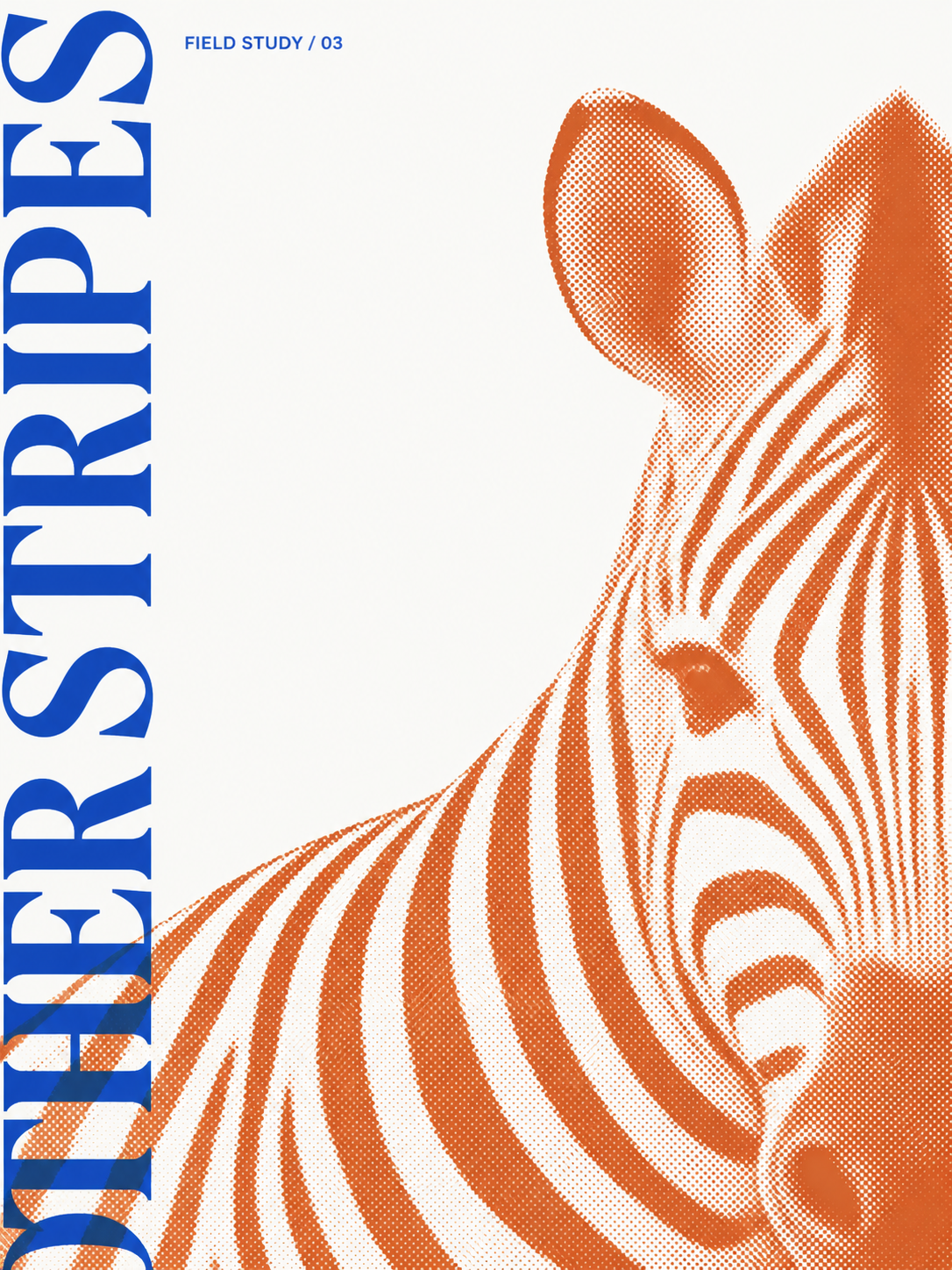
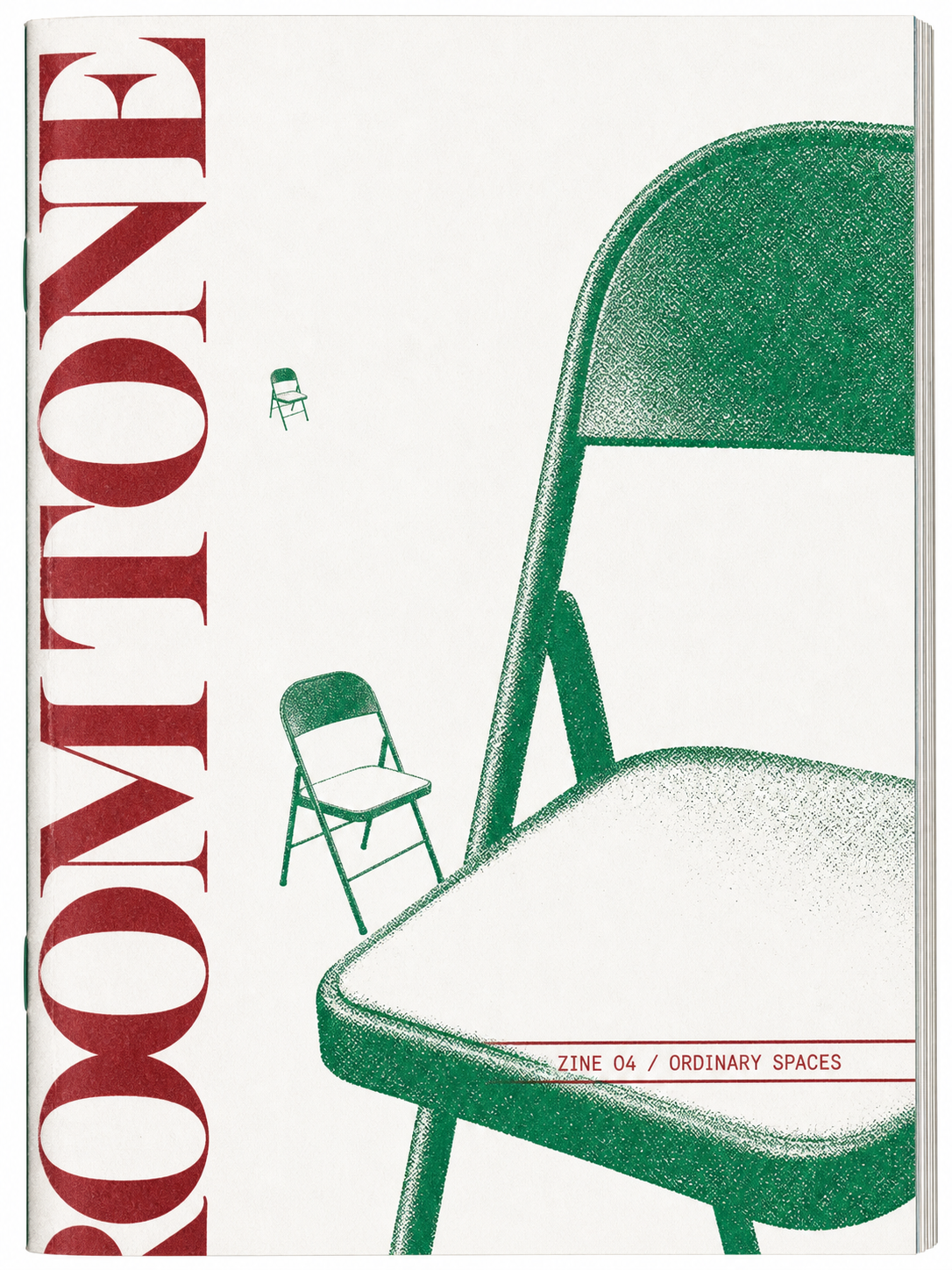
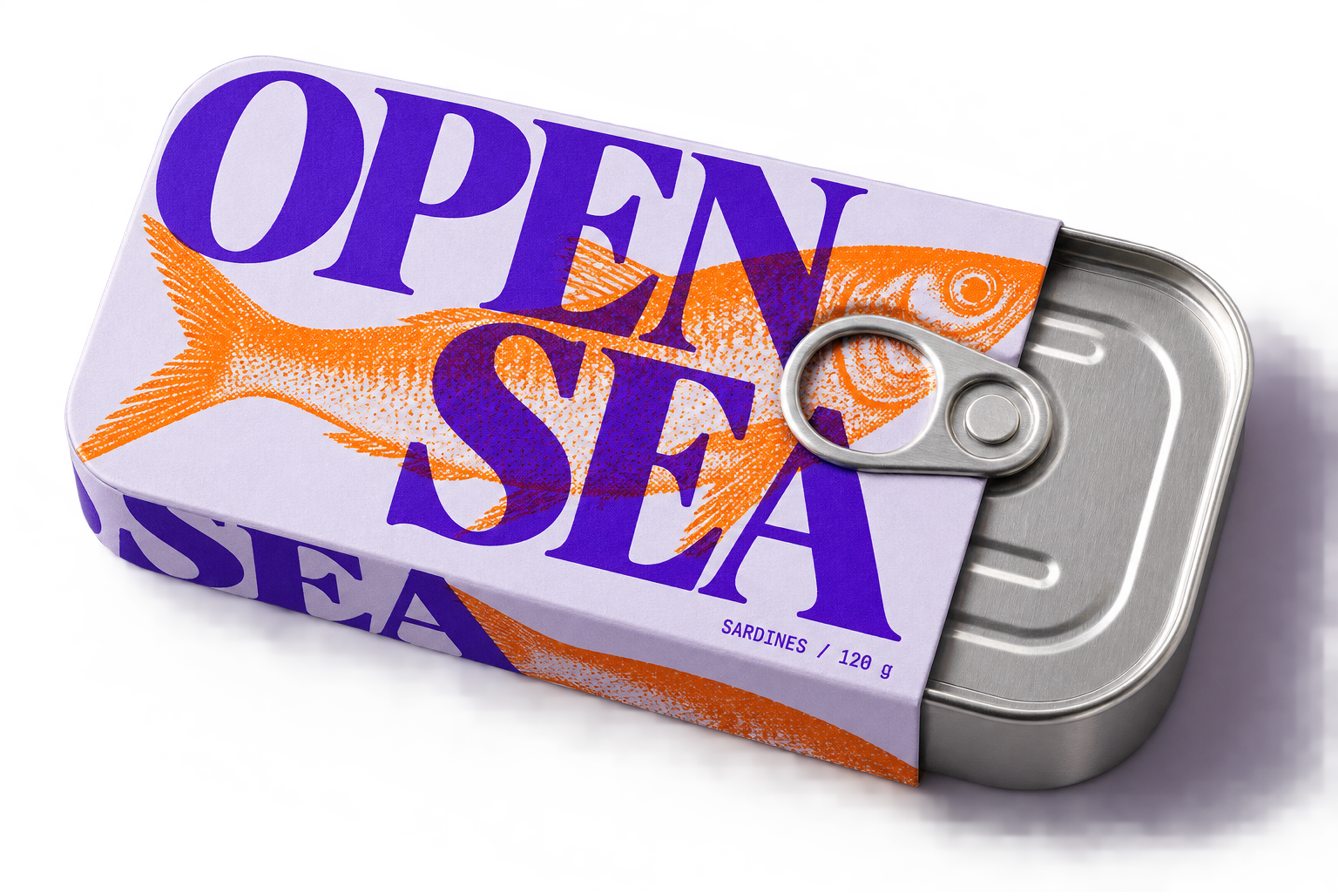
Selected examples
| Summer cycling | Field study | Ordinary spaces |
|---|---|---|
 |
 |
 |
| Sardine packaging | Headphone packaging | Sunscreen packaging |
|---|---|---|
 |
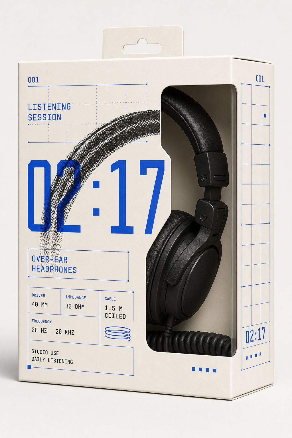 |
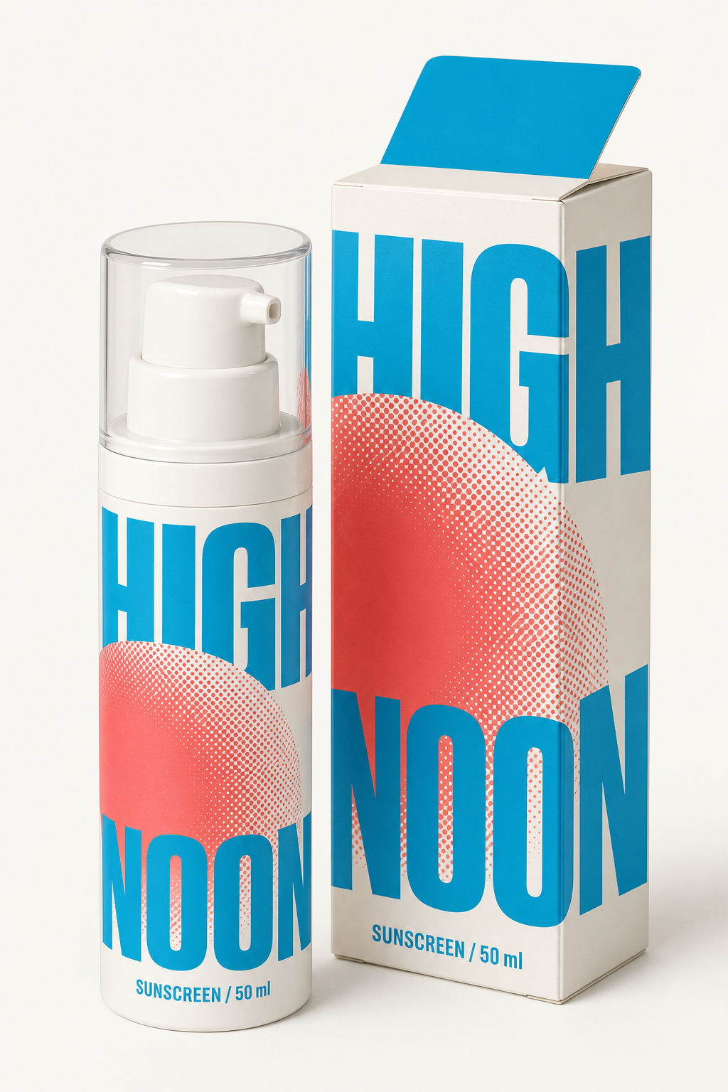 |
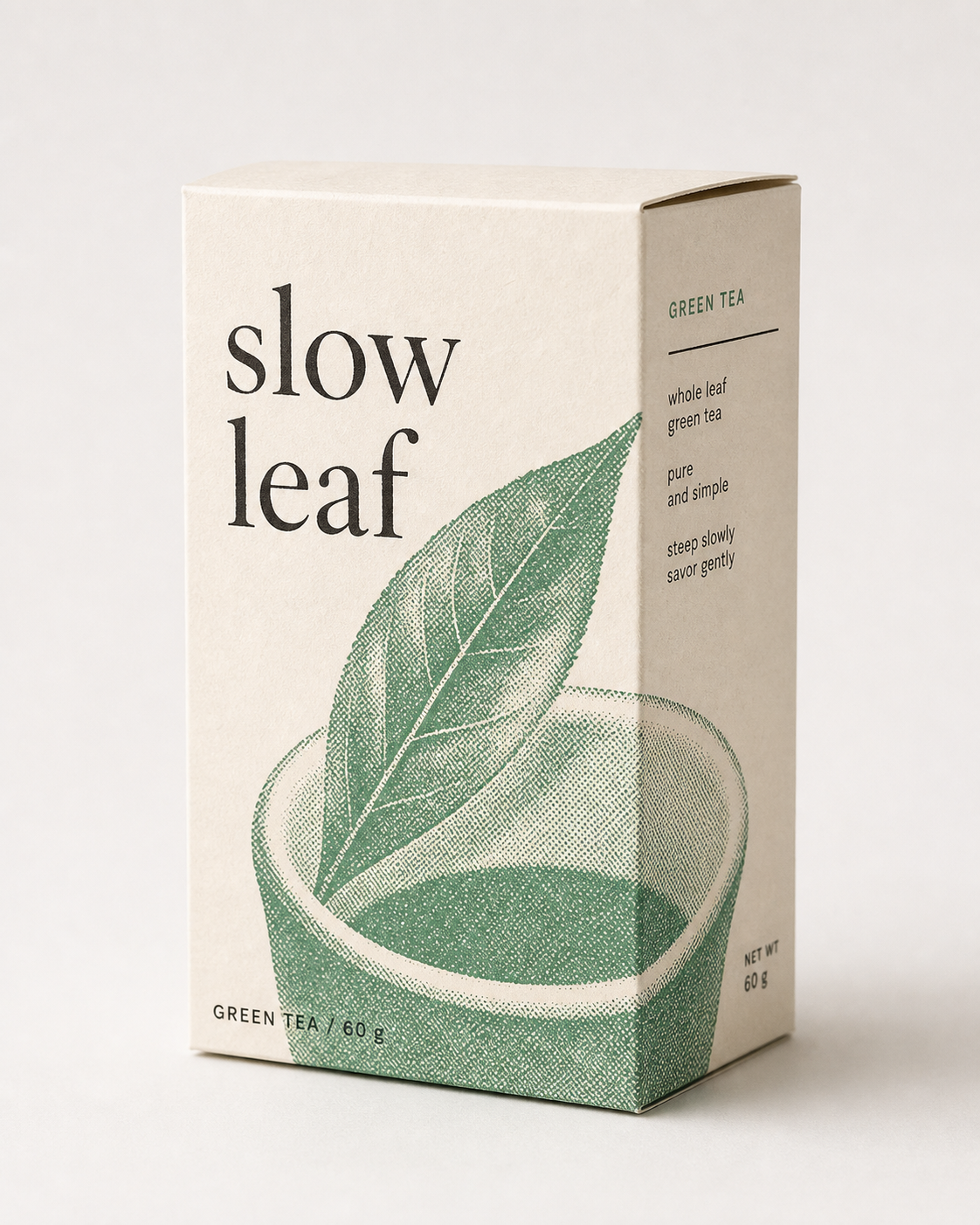
| A little warmth | Brand merchandise | Slow leaf |
|---|---|---|
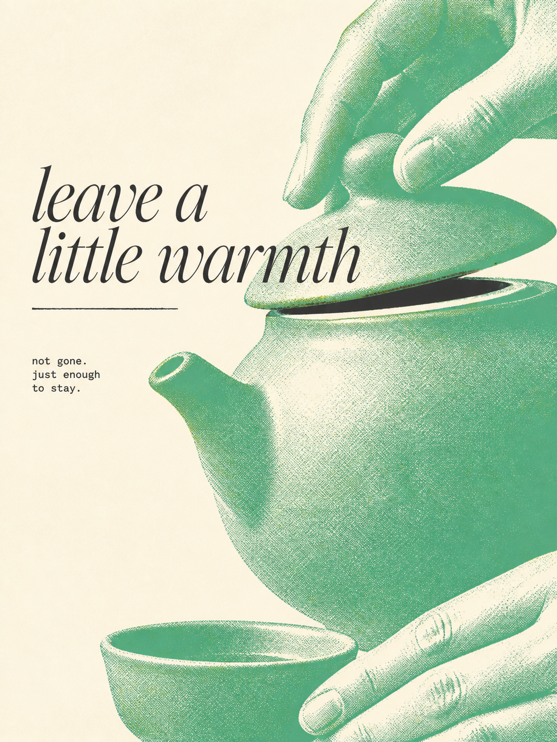 |
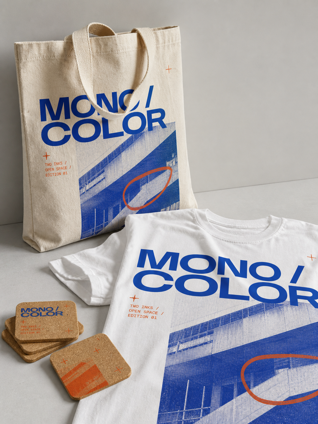 |
 |
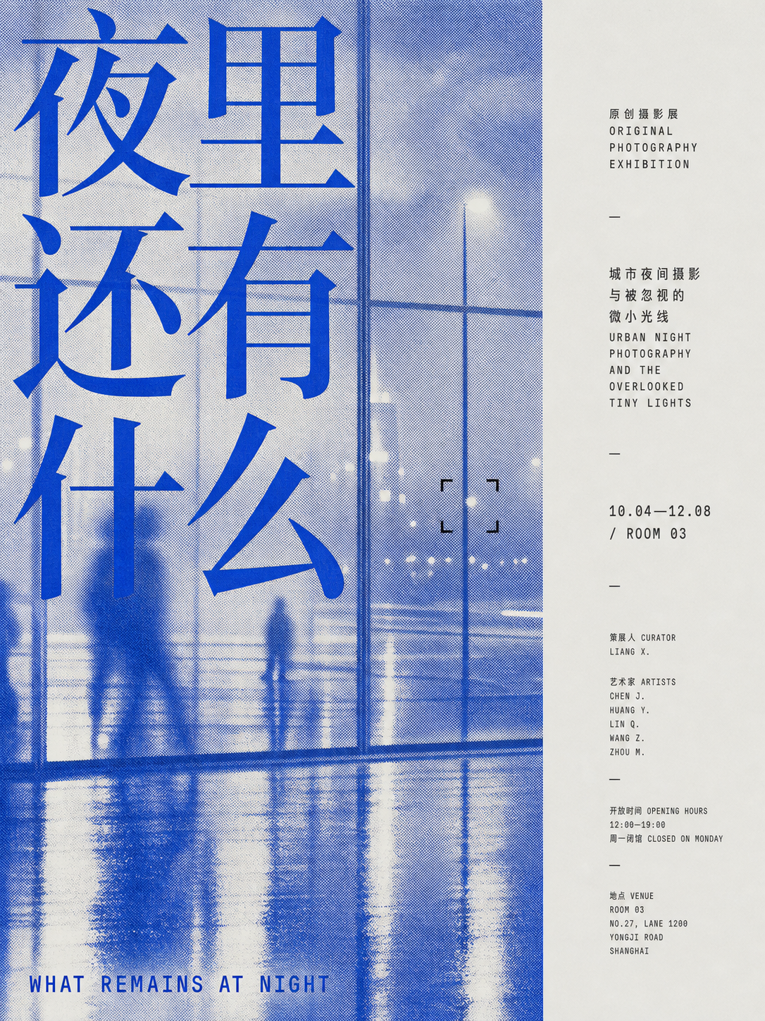
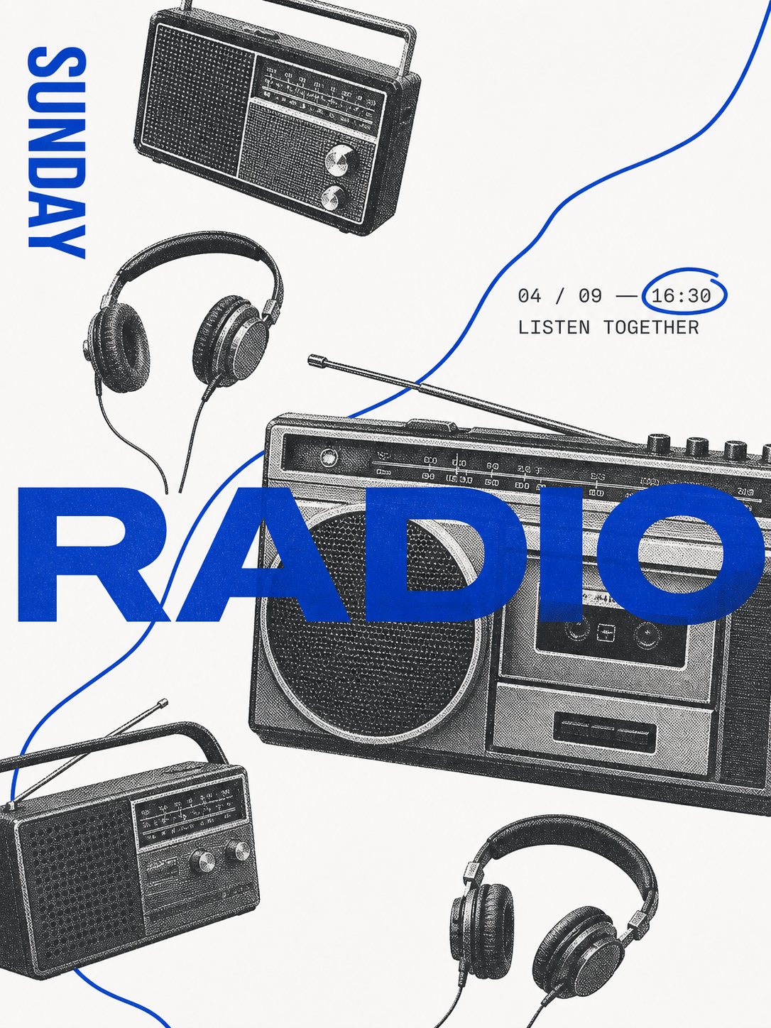
| Night photography | Sunday radio | Night market |
|---|---|---|
 |
 |
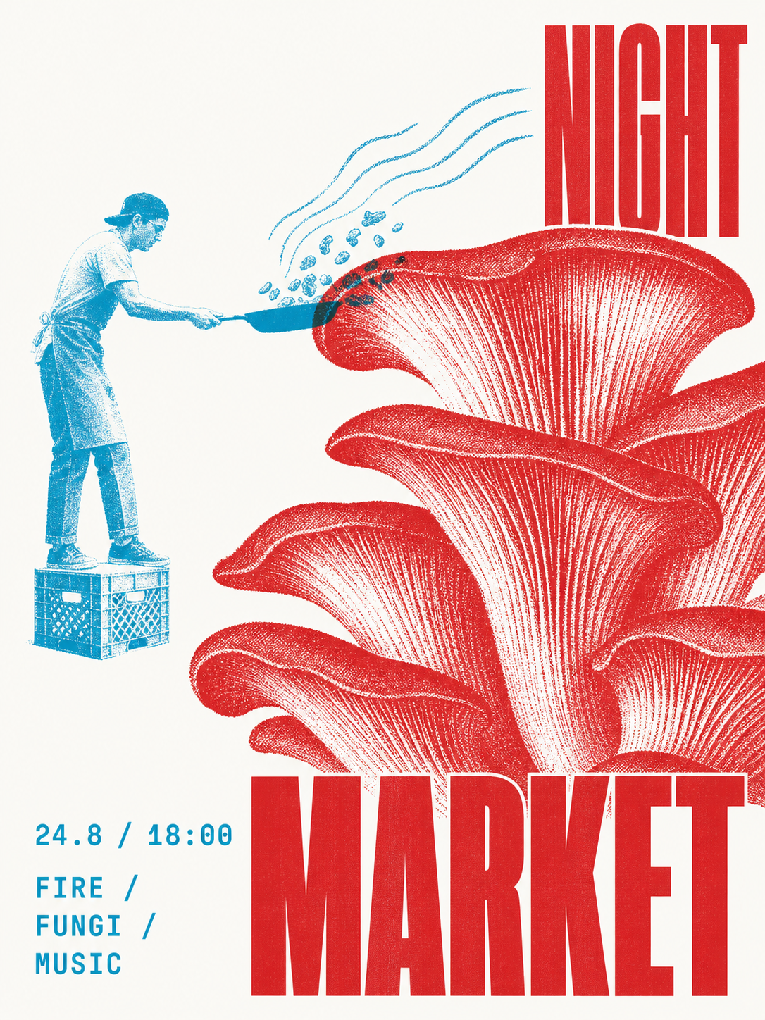 |
These original generated examples demonstrate the skill's range; they are outputs, not templates to reproduce.
Visual references
The visual system was informed by a twelve-image research set. See Visual References and Attribution for the complete image index, research notes, attribution status, and correction link. Third-party references remain the property of their respective creators and rights holders.
| 01 | 02 | 03 |
|---|---|---|
 |
 |
 |
| 04 | 05 | 06 |
 |
 |
 |
| 07 | 08 | 09 |
 |
 |
 |
| 10 | 11 | 12 |
 |
 |
 |
What it does
| System | Direction |
|---|---|
| Input | A theme, phrase, object, article idea, or supplied photograph |
| Palette | Adaptive neutral white, cool gray, or pale beige + controlled two-ink by default; explicit one-ink requests stay one-ink |
| Modes | Pure one-ink, chromatic + black, complementary duotone, or overprint duotone |
| Image | Halftone, risograph grain, cyanotype exposure, or photocopy breakup |
| Space | 25%–55% visible empty paper on an asymmetric editorial grid |
| Type | Content-responsive literary serif, cultural grotesk, condensed civic, programmatic, rotated, handwritten, or word-as-object roles |
| Output | Generated raster image, exact production prompt, and a short recipe |
Use cases
- Posters: events, parties, art exhibitions, city walks, and conceptual posters
- Social media: Xiaohongshu covers, WeChat article headers, podcast covers, and cultural commentary illustrations
- Brand materials: postcards, invitations, tickets, programs, menus, and packaging stickers
- Keepsakes: travel journals, photo album covers, and anniversary cards
- Books and publications: covers, title pages, chapter openers, and zine interiors
- Words: literary excerpts, poetry, and personal declarations
All of these formats can use a single ink to reduce production costs while retaining a distinctive visual identity.
How it works
1  Read the input       →  identify subject, intent, words, and image role
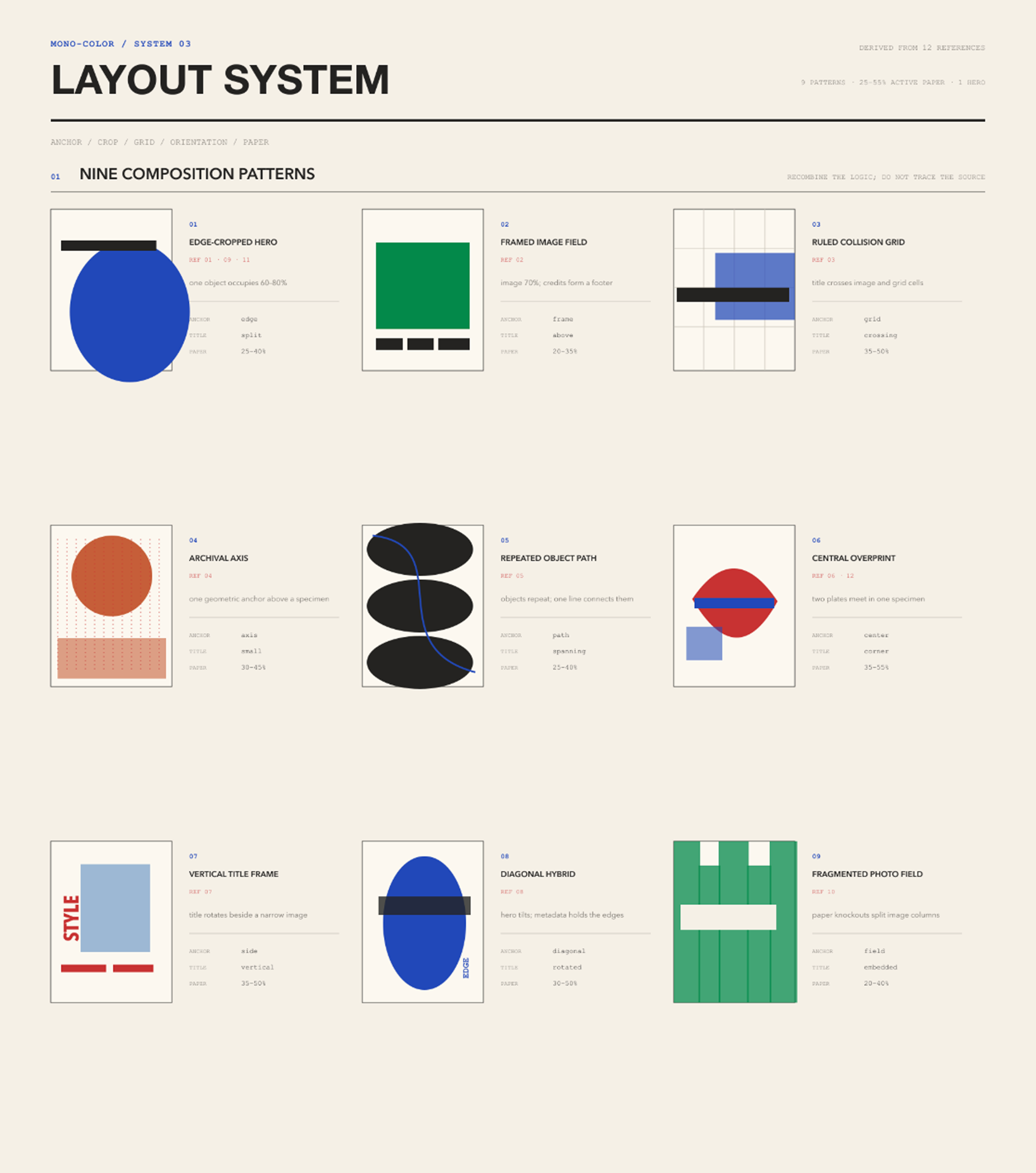
2  Choose the layout    →  image, specimen, declaration, object field, overprint, journal, or cover
3  Assign the plates    →  default to two assigned roles; switch to one plate when explicitly requested
4  Compose the page     →  preserve 25%–55% silence and add one deliberate disruption
5  Generate and inspect →  check ink count, identity, hierarchy, texture, and originality
Ink system
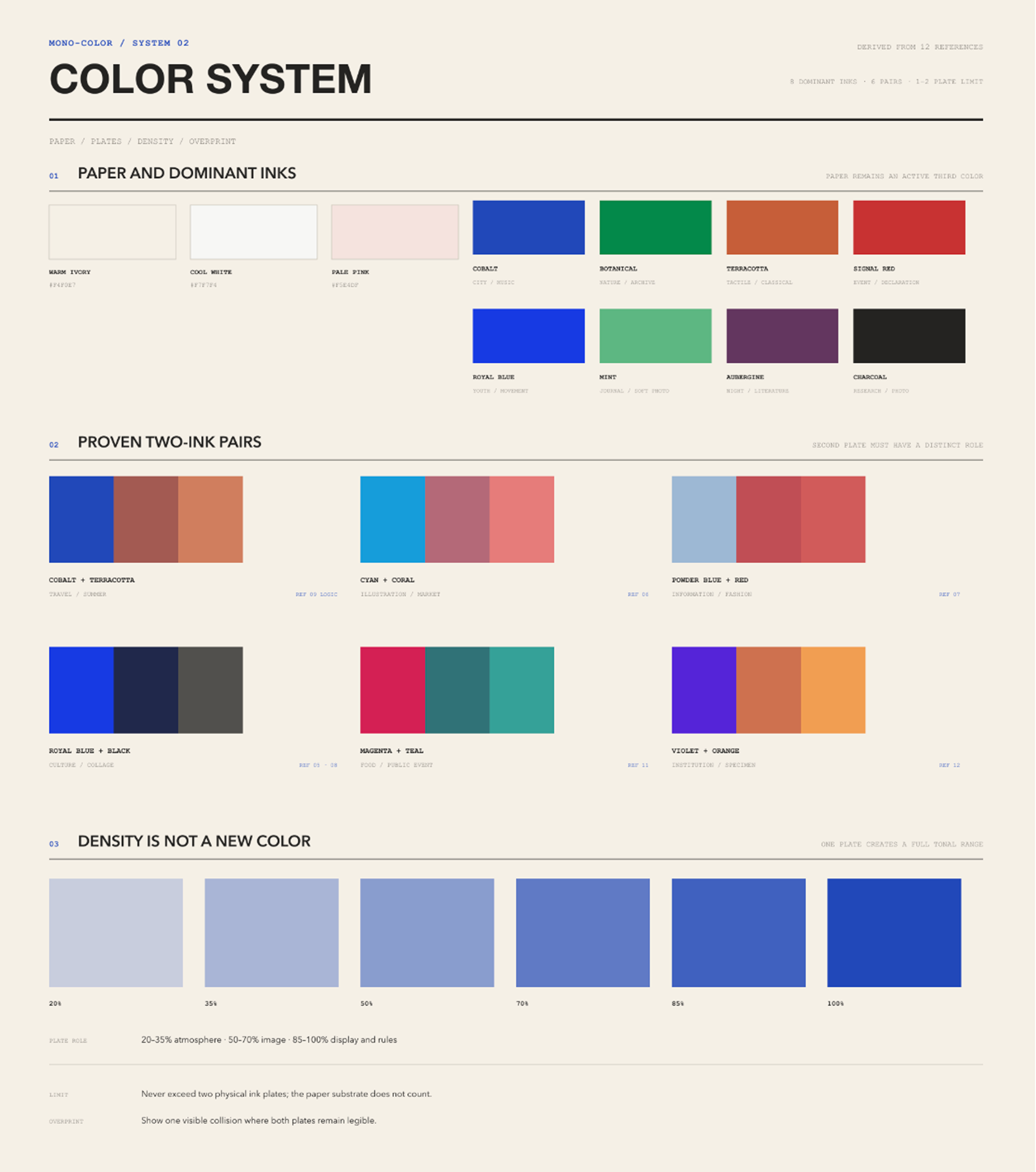
One-ink palette: Cobalt, Royal Blue, Botanical Green, Mint Green, Terracotta Orange, Signal Red, Aubergine, and Charcoal.
| Swatch | Ink | Hex |
|---|---|---|
 |
Cobalt / Ultramarine | #2148B8 |
 |
Royal Blue | #2058D4 |
 |
Botanical Green | #008A4B |
 |
Mint Green | #5EB783 |
 |
Terracotta Orange | #C65F38 |
 |
Signal Red | #C83232 |
 |
Aubergine | #63365F |
 |
Charcoal | #30343A |
Two-ink recipes: Powder Blue + Signal Red, Cobalt + Terracotta, Botanical Green + Oxblood, Charcoal + Signal Red, Electric Blue + Carbon, Mint Green + Charcoal, Ultramarine + Safety Orange, Cyan + Brick Red, and Tangerine + Slate Blue.
| Swatches | Two-ink recipe | Hex |
|---|---|---|
 |
Powder Blue + Signal Red | #9EB8D3 + #C83232 |
 |
Cobalt + Terracotta | #2148B8 + #C65F38 |
 |
Botanical Green + Oxblood | #008A4B + #8F3434 |
 |
Charcoal + Signal Red | #30343A + #C83232 |
 |
Electric Blue + Carbon | #173AE3 + #242321 |
 |
Mint Green + Charcoal | #5EB783 + #302D2E |
 |
Ultramarine + Safety Orange | #263E99 + #E55D2B |
 |
Cyan + Brick Red | #159DDA + #B64032 |
 |
Tangerine + Slate Blue | #E46C2D + #4773A5 |
In two-ink work, the dominant plate normally carries 70%–85% of the printed area. The accent plate carries 15%–30% and must have a specific job such as dates, annotations, selected objects, or overprint intersections. The substrate is not a third color, and the darker color created where two plates overlap is not a third ink.
Substrate is adaptive, not nostalgic by default: Neutral White #FAFAF7 supports crisp cultural, social, event, and image-led work; Cool Gray #E9E9E5 supports architecture, technology, charcoal-led systems, and restrained branding; Pale Beige #F5F1E8 supports tactile, travel, food, intimate, archival, or explicitly nostalgic subjects. Limited inks and halftone do not automatically imply vintage styling.
Visual rules
- No more than two printing inks. Controlled two-ink is the default: 70%–85% dominant plate and 15%–30% accent plate, each with a distinct role. Explicit one-ink requests use one plate.
- Paper stays visible. The result is a printed page, not a digitally tinted monochrome wash.
- Mechanical reproduction leads. Photographs become dots, grain, clipped highlights, ink pooling, and mild registration drift between plates.
- Silence has structure. Empty paper occupies 25%–55% of the canvas and controls pacing.
- Type has tension and range. Choose one content-responsive display skeleton and one utility voice; use handwriting only as a short optional interjection. A series may change display categories instead of repeating one house treatment.
- Identity stays intact. Supplied people, objects, and scenes remain recognizable.
- References are grammar, not templates. At least four structural variables change from every supplied reference.
Not this
- not a full-color photograph with a monochrome filter
- not arbitrary two-color decoration or more than two printing plates
- not a glossy mockup, 3D render, gradient poster, or cinematic scene
- not a centered template, card grid, sticker collage, or decorative blob system
- not dense scrapbook grunge or torn-paper styling
- not automatically retro, yellowed, sepia, distressed, or nostalgic because the work uses halftone or limited inks
- not marketing copy, invented branding, fake sponsors, URLs, or QR codes
- not a reconstruction of a reference poster or artist signature
Install
Clone the repository into your Claude Code skills directory:
git clone https://github.com/yanliudesign/mono-color-skill.git \
	~/.claude/skills/mono-color
Restart Claude Code after installation. Other agent environments can load SKILL.md as the skill entry point.
Try it
Use mono-color to make a vertical poster about a midnight convenience store.
The exact headline is “still open”.
Turn this portrait into a cobalt one-ink editorial zine cover.
Keep the person's identity and expression.
Create a botanical-green risograph field note about ferns.
The title is “field note 07”.
Create an Ultramarine + Safety Orange overprint poster about city cycling.
Let the bicycle and oversized title cross in selected areas.
Turn this product into a Cyan + Brick Red repeated-object cover.
Keep one open zone for the title and factual microcopy.
Make a Signal Red one-ink party poster for a rooftop gathering.
Use “after sunset” as the headline and keep the date small.
Design a Charcoal + Signal Red exhibition poster about concrete architecture.
Use the red plate only for the date, location, and one geometric interruption.
Create a cobalt city-walk poster from this street photograph.
Turn the buildings into coarse halftones and title it “north by foot”.
Make a Terracotta Orange Xiaohongshu cover about a weekend flea market.
Use one oversized Chinese headline and leave at least one third of the paper empty.
Turn this host portrait into an Aubergine one-ink podcast cover.
Keep the face recognizable and use “the quiet hour” as the episode title.
Create a Botanical Green + Oxblood invitation for an independent bookstore opening.
Let green carry the paper texture and image; reserve oxblood for event details.
Transform these travel photographs into a Cobalt + Terracotta postcard series.
Keep the same grid across the set, but vary each crop and handwritten annotation.
Design a Mint Green + Charcoal poetry title page for the line “we kept the window open”.
Use no photograph, generous paper space, and one small archival-style note.
Delivery format
One run returns:
- a generated raster image when image-generation tools are available;
- the exact production-ready prompt used for generation;
- a recipe naming the print mode, exact ink palette, layout family, type pairing, print process, and originality changes.
If image generation is unavailable, the skill returns the production-ready prompt and states the limitation.
Stability and validation
Before prompt compilation, the skill resolves every request into a fixed recipe manifest. Unspecified requests use a 3:4 ratio, Neutral White substrate, contemporary editorial direction, 35% empty substrate, and deterministic palette and layout rules. The substrate may switch to Cool Gray or Pale Beige when the image and ink contrast call for it. Supplied photos default to faithful reproduction; requests for abstract, artistic, loose, experimental, or less realistic treatment switch to deterministic symbol extraction that preserves 2-4 identity anchors. Explicit user choices still take precedence within the two-ink and originality limits.
The design-system/ catalogs make the visual grammar reusable and inspectable. They separate color tokens, typography roles, composition geometry, carrier-specific signals, visual rhythm, and controlled print imperfections from the prose workflow. Catalog IDs are the shared contract between reference boards, recipes, and validation.
design-system/rhythm.json defines relaxation as uneven energy rather than uniformly reduced intensity. Each page selects one audacious focal event—oversized type, an extreme crop, one giant detail, a concentrated overprint, or an abnormal scale relationship—then releases the rest through paper, pale screening, and sparse functional type. Without a supplied photograph, people become 2-4 identifying anchors and partial crops instead of complete stock figures or a safe headline-left/photo-right split. Empty paper and unresolved edges now respond to the focal event instead of fixed quotas.
Controlled chance stays in the reproduction layer: contemporary work selects 0-2 restrained effects, while tactile, vintage, or archival-aging work selects 2-3 bounded effects such as uneven ink density, dry-edge breakup, halftone drift, registration drift, or one broken gesture. The stable recipe seed preserves the same marks across retries without moving the composition or reducing text readability.
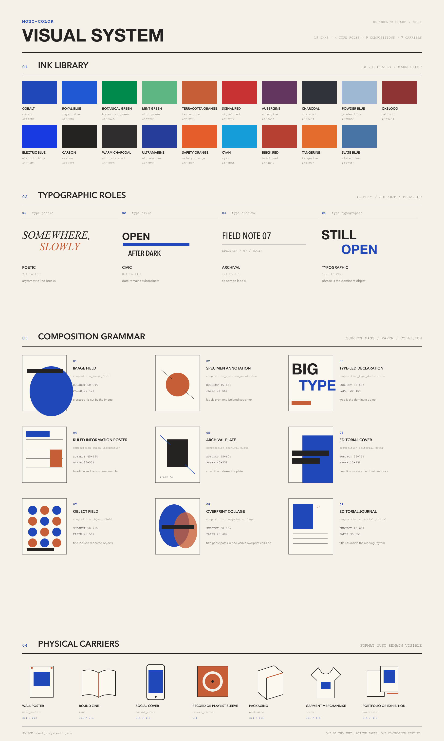
The four focused reference-analysis boards document the typography, color, layout, and style evidence behind the system:
Typography
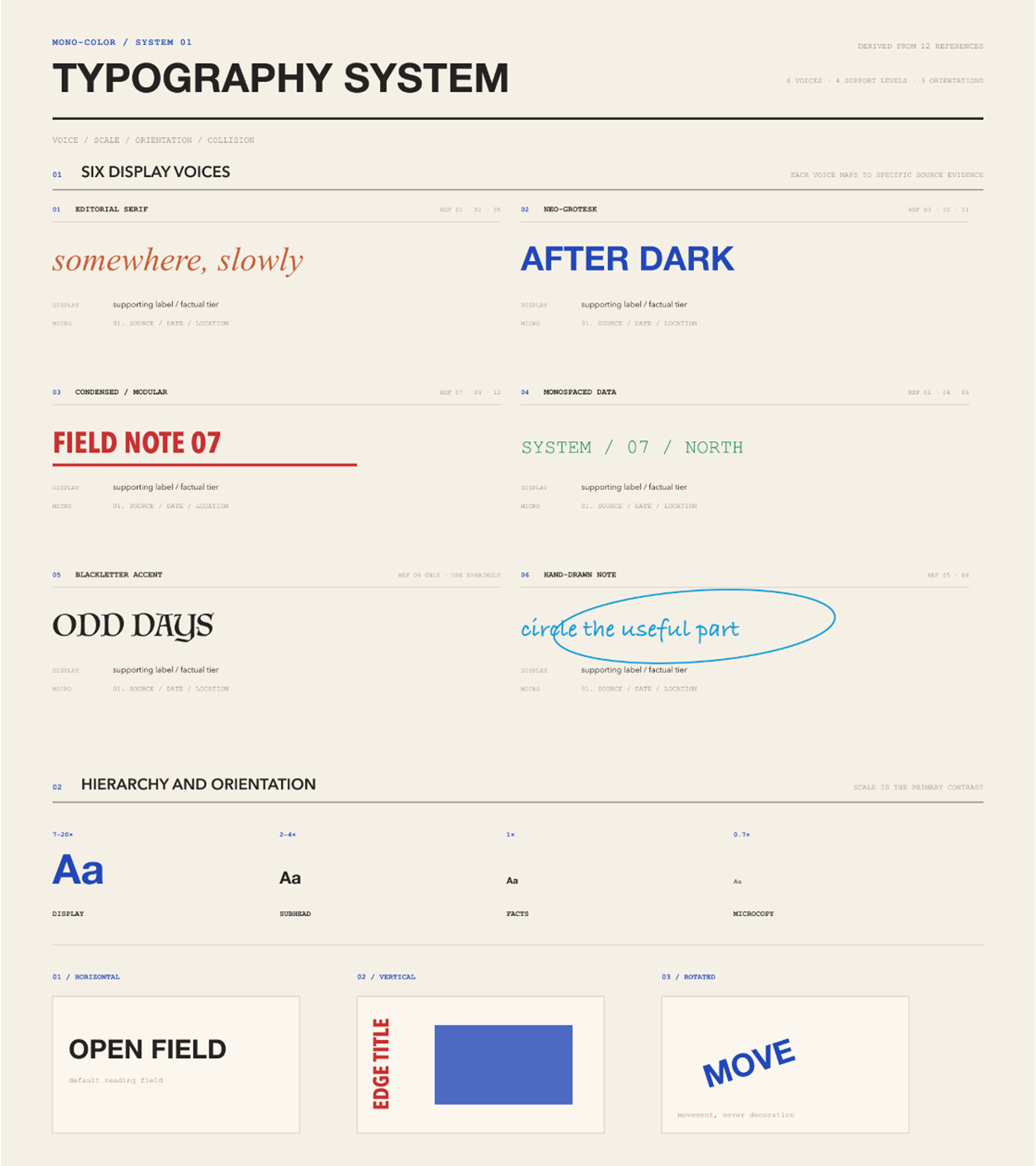
Color
Layout
Style
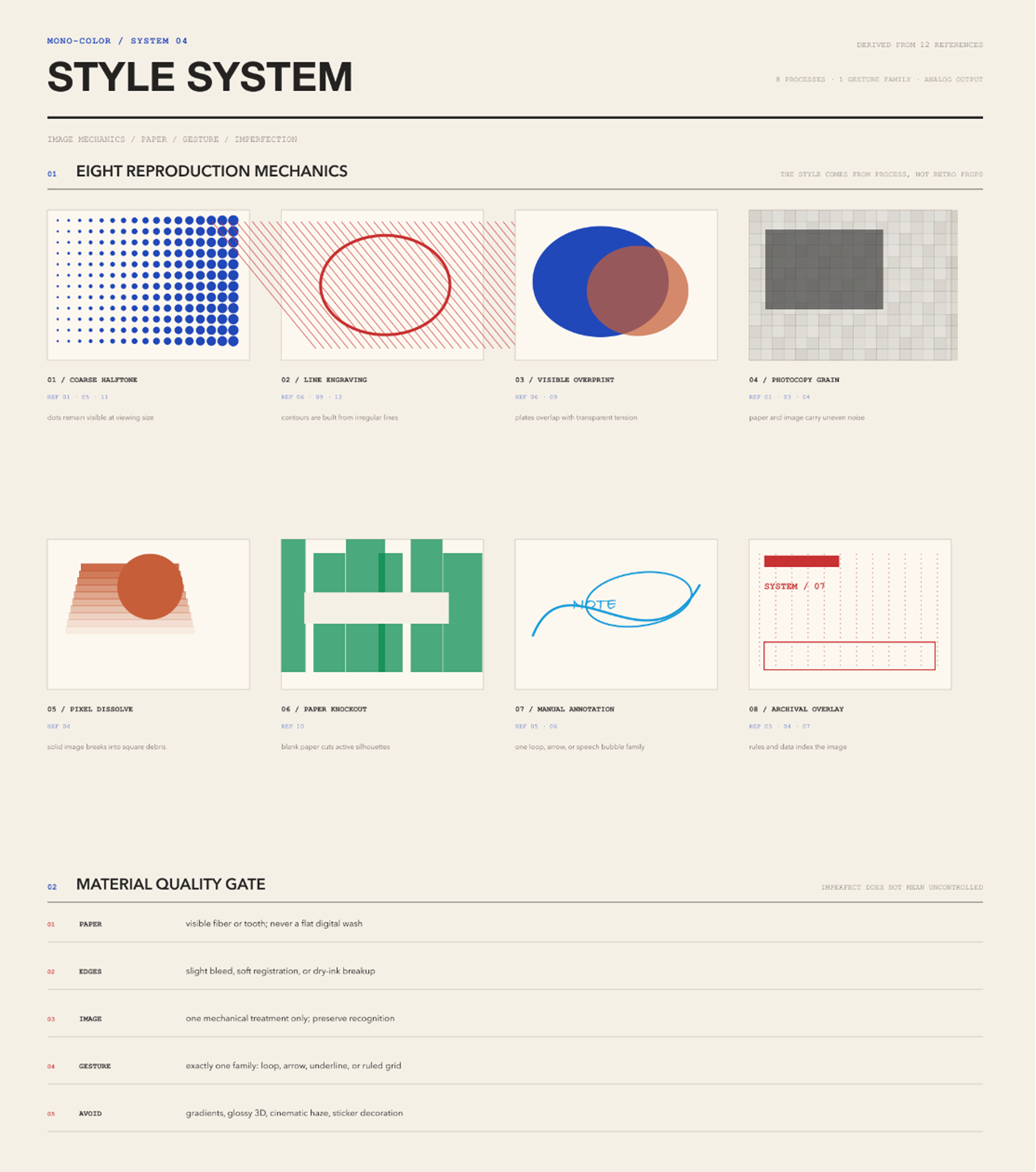
Regenerate the catalog-driven complete board after editing a catalog:
python3 scripts/build_design_system_board.py
The evaluation contract covers defaults, supplied portraits, botanical work, overprint, event information, long-form text, prompt-only output, conflicting color requests, repeated objects, and reference-copying requests. Run it locally with:
python3 scripts/validate_evals.py
python3 scripts/validate_design_system.py
GitHub Actions runs the same contract on every pull request and push to main.
Repository layout
mono-color-skill/
├── .github/workflows/ # Continuous validation
├── design-system/    # Machine-readable color, composition, rhythm, and print patterns
├── examples/         # Original generated examples shown in the READMEs
├── scripts/          # Evaluation and design-system validators
├── swatches/         # One-ink and two-ink palette previews
├── SKILL.md          # Trigger rules, visual system, workflow, and quality gate
├── README.md         # English documentation
├── README.zh.md      # 中文说明
├── CHANGELOG.md      # Release history
└── evals/
		├── evals.json    # Representative prompts and deterministic assertions
		└── schema.json   # Evaluation contract schema
Originality
This skill extracts system-level qualities such as palette, print process, spacing, hierarchy, and communication tone. It does not copy a reference's composition, wording, labels, logos, border system, or distinctive arrangement.
When a user supplies a photograph, the subject is preserved as content while the crop, screening, grid, type placement, and metadata treatment are newly constructed.
License
The source code, skill instructions, and scripts are available under the MIT License.
Original examples by Yan Liu in examples/ are © 2026 Yan Liu and are not covered by the MIT License. The twelve third-party research references remain the property of their respective creators and rights holders. See the Visual Asset License and Visual References and Attribution.
Created by Dreameryanyan · LinkedIn · X
把一个主题、一句话、一个物件或一张照片,转成原创的编辑视觉。Skill 默认使用受控双色:一块主墨版承担主体,另一块辅墨版只负责一个明确事件。用户明确要求单色、单墨或只指定一种油墨时,仍使用纯单色。背景会根据主图和油墨从中性白、冷灰与淡米色中选择;默认是当代 Editorial,而不是复古做旧。
它保留的是一套视觉系统,而不是照抄参考图。每次构图都会根据主体、意图、文字和图像角色重新建立。
精选示例
| 夏日骑行 | 田野观察 | 日常空间 |
|---|---|---|
|
|
|
| 沙丁鱼包装 | 耳机包装 | 防晒包装 |
|---|---|---|
|
|
|
| 留一点温度 | 品牌周边 | 慢叶茶 |
|---|---|---|
|
|
|
| 夜里还有什么 | 周日收音机 | 夜市 |
|---|---|---|
|
|
|
这十二张原创生成示例用于展示 skill 的能力范围,是输出案例,不是供复刻的模板。
视觉参考与署名
视觉系统的研究基于一组 12 张参考图片。完整图片清单、研究笔记、署名状态与纠错入口见 Visual References and Attribution。第三方参考作品的版权归各自创作者与权利人所有。
| 01 | 02 | 03 |
|---|---|---|
|
|
|
| 04 | 05 | 06 |
|
|
|
| 07 | 08 | 09 |
|
|
|
| 10 | 11 | 12 |
|
|
|
它能做什么
| 系统 | 方向 |
|---|---|
| 输入 | 主题、短句、物件、文章想法或用户提供的照片 |
| 配色 | 自适应中性白、冷灰或淡米色 + 默认受控双色;明确单色请求保持单墨 |
| 模式 | 纯单色、彩色 + 黑墨、互补双色或叠印双色 |
| 图像 | 网点、孔版颗粒、蓝晒曝光感或复印机破碎质感 |
| 留白 | 25%–55% 可见纸面,采用非对称编辑网格 |
| 字体 | 根据内容选择文学衬线、文化几何体、窄体公共标题、数字信息体、旋转纵排、手写插话或文字物件 |
| 输出 | 生成位图、完整生产 Prompt 与简短配方说明 |
适用场景
- 海报:活动、party、艺术展、城市散步、观念海报
- 社交媒体:小红书封面、公众号头图、播客封面、文化评论插图
- 品牌物料:明信片、邀请函、门票、节目单、菜单、包装贴纸
- 纪念物:旅行札记、照片册封面、日期纪念卡
- 书籍与刊物:封面、扉页、章节页、zine 内页
- 文字:文学短句、诗歌、个人宣言
这些场景都能利用单墨色降低制作成本,同时保留鲜明识别度。
工作方式
1  读取输入      →  确定主体、意图、文字与图像角色
2  选择版式      →  图像、标本、文字宣言、物件场、叠印拼贴、编辑日志或封面
3  分配印版      →  默认两块职责明确的印版;明确要求单色时切换为一块
4  组织画面      →  保留 25%–55% 留白,并加入一个有意的打破点
5  生成并检查    →  核对油墨数量、主体身份、层级、材质与原创性
油墨系统
**单色主题:**钴蓝、皇家蓝、植物绿、薄荷绿、陶土橙、信号红、茄紫与炭黑。
| 图例 | 油墨 | Hex |
|---|---|---|
|
钴蓝 / 群青 | #2148B8 |
|
皇家蓝 | #2058D4 |
|
植物绿 | #008A4B |
|
薄荷绿 | #5EB783 |
|
陶土橙 | #C65F38 |
|
信号红 | #C83232 |
|
茄紫 | #63365F |
|
炭黑 | #30343A |
**双色配方:**粉蓝 + 信号红、钴蓝 + 陶土橙、植物绿 + 酒红、炭黑 + 信号红、电光蓝 + 碳黑、薄荷绿 + 炭黑、群青 + 安全橙、青蓝 + 砖红、橘色 + 灰蓝。
| 图例 | 双色配方 | Hex |
|---|---|---|
|
粉蓝 + 信号红 | #9EB8D3 + #C83232 |
|
钴蓝 + 陶土橙 | #2148B8 + #C65F38 |
|
植物绿 + 酒红 | #008A4B + #8F3434 |
|
炭黑 + 信号红 | #30343A + #C83232 |
|
电光蓝 + 碳黑 | #173AE3 + #242321 |
|
薄荷绿 + 炭黑 | #5EB783 + #302D2E |
|
群青 + 安全橙 | #263E99 + #E55D2B |
|
青蓝 + 砖红 | #159DDA + #B64032 |
|
橘色 + 灰蓝 | #E46C2D + #4773A5 |
双色作品通常由主墨承担 70%–85% 的印刷面积,辅墨承担 15%–30%,并只负责日期、注释、特定物件或叠印交叉等明确任务。背景基材不算第三色,两块印版重叠后形成的深色也不算第三种油墨。
**背景自适应,不默认怀旧:**中性白 #FAFAF7 适合清爽的文化、社交、活动与彩色主图;冷灰 #E9E9E5 适合建筑、科技、炭黑体系与克制品牌;淡米色 #F5F1E8 适合触觉、旅行、食物、亲密、档案或明确要求怀旧的主题。限制油墨和使用网点,并不等于自动复古。
视觉规则
- 最多使用两种印刷油墨。 默认受控双色:主墨占 70%–85%,辅墨占 15%–30%,各自承担明确职责;明确单色请求使用一块印版。
- 纸张必须可见。 结果应像真实印刷页面,而不是数字化单色滤镜。
- 机械复制质感优先。 照片要转成网点、颗粒、断裂高光、积墨和印版之间的轻微套印偏移。
- 留白参与叙事。 空白纸面占画布的 25%–55%,用于控制阅读节奏。
- 字体必须有张力,也允许变化。 每张选择一种符合内容的主字体骨架和一种功能字体;手写只作为可选的短插话。一组作品可以改变主字体类别,不必重复同一种固定处理。
- 主体身份保持不变。 用户提供的人物、物件和场景必须可辨认。
- 参考图是语法,不是模板。 相对每张参考图,至少改变四个结构变量。
不做这些
- 不是给全彩照片套一个单色滤镜
- 不是随意的双色装饰,也不使用两块以上的印版
- 不是光滑样机、3D 渲染、渐变海报或电影感场景
- 不是居中模板、卡片网格、贴纸拼贴或装饰色块系统
- 不是密集的剪贴簿 Grunge 或撕纸风格
- 不因网点或限制色自动加入泛黄、棕褐、破旧边框、怀旧物件或复古字体
- 不写营销文案,不虚构品牌、赞助商、网址或二维码
- 不复刻参考海报,也不模仿艺术家签名
安装
克隆到 Claude Code 的 skills 目录:
git clone https://github.com/yanliudesign/mono-color-skill.git \
  ~/.claude/skills/mono-color
安装后重启 Claude Code。其他 Agent 环境可以直接把 SKILL.md 作为 skill 入口加载。
试一试
用 mono-color 做一张关于凌晨便利店的竖版海报,文案是“still open”。
把这张人物照片做成钴蓝单色编辑 Zine 封面,保留人物身份和表情。
做一张蕨类植物主题的绿色孔版观察笔记,标题是“field note 07”。
用群青 + 安全橙做一张城市骑行叠印海报,让自行车与超大标题在局部交叉。
把这个产品做成青蓝 + 砖红的重复物件封面,为标题和事实型小字保留一块空白区域。
做一张信号红单色屋顶 party 海报,主标题是“日落之后”,日期保持小号。
做一张混凝土建筑主题的炭黑 + 信号红艺术展海报,红色只用于日期、地点和一个几何打破点。
把这张街景照片做成钴蓝单色城市散步海报,将建筑处理成粗网点,标题是“向北步行”。
做一张周末跳蚤市场主题的陶土橙小红书封面,使用一个超大中文标题,并保留至少三分之一空白纸面。
把这张主持人肖像做成茄紫单色播客封面,保留面部辨识度,单集标题是“安静的一小时”。
为独立书店开幕设计一张植物绿 + 酒红邀请函:绿色负责纸张质感与图像,酒红只负责活动信息。
把这些旅行照片做成一组钴蓝 + 陶土橙明信片,整组使用同一网格,但改变每张的裁切与手写批注。
为诗句“我们一直开着窗”设计一张薄荷绿 + 炭黑扉页,不使用照片,保留大量纸面,只加一条档案式小注释。
交付格式
每次运行返回:
- 在有图像生成工具时生成一张位图;
- 实际使用的完整生产级 Prompt;
- 一份配方说明,列出印刷模式、准确油墨配方、版式家族、字体搭配、印刷工艺与原创性变化。
如果当前环境不能生成图像,skill 会明确说明限制,并提供可直接使用的生产级 Prompt。
稳定性与验证
生成 Prompt 前,skill 会先把每次请求解析成固定的 recipe manifest。用户未指定时,统一采用 3:4 比例、中性白背景、当代 Editorial 方向、35% 留白,以及确定性的配色和版式选择规则;主图和油墨需要时可切换为冷灰或淡米色。输入照片默认采用保真再现;当用户要求抽象、艺术、松弛、实验性或降低写实度时,会切换为确定性的符号提取,并保留 2-4 个身份锚点。用户的明确要求仍然优先,但不能突破双色上限与原创性规则。
design-system/ 目录把视觉语法变成可以复用、检查的数据,分别保存颜色 token、字体角色、构图几何、载体识别信号、视觉节奏和受控印刷偏差。参考板、生成配方和校验器共用同一套 ID,避免视觉规则只存在于描述性文字里。
design-system/rhythm.json 把“松弛感”定义为不均匀的能量分布,而不是统一降低强度。每张作品选择一个大胆的主视觉事件,例如超大文字、极端裁切、巨大局部、集中叠印或异常尺度;其他区域通过纸面、浅网点和稀疏功能文字主动释放。无参考照片的人物默认拆成 2–4 个识别锚点与局部裁切,避免完整图库人物和安全的“左标题、右照片”构图。留白比例与未收口边缘都由主视觉事件决定,不再强制固定数值。
“可控偶然”只发生在印刷表现层:当代 Editorial 选择 0–2 种克制效果;触觉、复古或档案做旧方向选择 2–3 种有边界的效果,例如油墨浓淡、干墨破边、网点漂移、套印偏移或一处断开的手工笔触。相同输入会复现同样的偏差,同时不移动核心构图、不损伤文字可读性。
四张专项参考分析板分别记录字体、颜色、排版和风格证据:
字体
颜色
排版
风格
修改 catalog 后,可以重新导出由 catalog 驱动的综合总表:
python3 scripts/build_design_system_board.py
评测契约覆盖默认输入、人物照片、植物主题、双色叠印、活动信息、长文本、仅输出 Prompt、颜色冲突、重复物件和照抄参考图等情况。本地运行:
python3 scripts/validate_evals.py
python3 scripts/validate_design_system.py
每次 pull request 和推送到 main 时,GitHub Actions 都会运行同一套检查。
仓库结构
mono-color-skill/
├── .github/workflows/ # 持续验证
├── design-system/    # 机器可读的颜色、构图、节奏与印刷模式
├── examples/         # README 中展示的原创生成示例
├── scripts/          # 评测与设计系统校验脚本
├── swatches/         # 单色与双色色板
├── SKILL.md          # 触发规则、视觉系统、工作流与质量门槛
├── README.md         # 英文说明
├── README.zh.md      # 中文说明
├── CHANGELOG.md      # 版本记录
└── evals/
  ├── evals.json    # 典型触发语与确定性断言
  └── schema.json   # 评测契约 Schema
原创性
这个 skill 提取的是配色、印刷工艺、空间密度、字体层级和沟通语气等系统特征。它不会复制参考图的构图、文案、标签、Logo、边框系统或标志性排列。
当用户提供照片时,主体身份会被保留,但裁切、网点、网格、文字位置和信息标注都会重新设计。
许可证
源代码、Skill 指令和脚本采用 MIT License。
examples/ 目录中由 Yan Liu 创作的原创示例 © 2026 Yan Liu,不包含在 MIT License 中;12 张第三方研究参考图的版权归各自创作者与权利人所有。详见视觉资产许可证与视觉参考和署名。
Created by Dreameryanyan · LinkedIn · X